KALYMERA
Агентством IQ HARVEST был разработан как сам бренд KALYMERA, так и создана новая для российского рынка товарная ниша – мясной бутик.
Очертания фирменного знака навеяны сочетанием форм клейма для скота и бумажным свертком упакованного мяса.
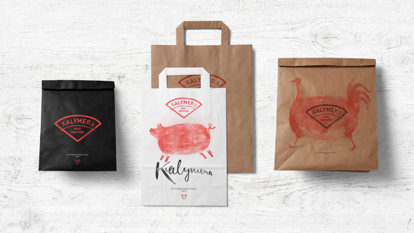
Основной цвет удачно подчеркивает продуктовую часть и в тоже время не имеет агрессивной составляющей, обычно присущей красному, а премиальный характер бренда нашел свое отражение в классическом черном цвете.
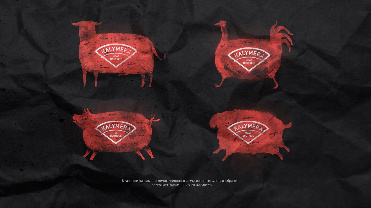
Для создания аутентичной атмосферы была продумана бренд-среда – набор символов, находящихся на родственной бренду смысловой и графической территории. В соответствии с видами реализуемого в бутике мяса, в айдентике задействованы графические образы (парящий барашек, широко шагающая курица, задумчивая корова и любопытный поросенок), являющиеся не формальными идентификаторами продукта, а настоящими характерами, обеспечивающими узнаваемость как бренду в целом, так и каждому конкретному его носителю.
Каллиграфическое исполнение названия служит вспомогательным графическим элементом основному фирменному знаку, а вместе со специально разработанным для бренда рукописным шрифтом подчеркивают индивидуальный подход к каждому покупателю и поколенческие фермерские традиции.
Agency IQ Harvest has developed a new brand identity for stores Kalymera. The outlines of the logo of the new brand at the same time like a stamp (stamp) for the animals and for meat packaging bag. To create an atmosphere of graphics experts developed a brand environment - a set of symbols that are related to the brand meaning and the graphics area. Symbols are combined in groups in various combinations and are used as patterns to fill the various forms. In the interior, the agency has proposed to use not only the logo and the familiar graphic form, but also a tree - to reflect the idea of freshness and naturalness of meat. In addition, there have been several types and sizes of packages suitable for different scenarios shopping, and designer clothes, are reflected in his black premium character of the brand. What's Unique? Meat and juicy steaks, printed on the craft in two colors, have long turned into a cliche branch. It is more difficult to avoid its impact by developing identity for such a service for the domestic market. IQ Harvest was able to present a professional and very charming author's interpretation of the collective's reference, withdrawing from direct borrowing: the engine became puffy pictures of animals with a recognizable stamp-sector. Soaring lamb striding chicken, cow thoughtful, curious pig - not a formal product identifiers, but real characters, providing recognition as a brand as a whole and each individual its bearer.